Development
Our User Research process enabled us to learn directly from artists and audience across Saskatchewan and to develop service prototypes in response. Our second series of design workshops in communities across Saskatchewan, as well as user tests at the Canadian Craft Federation’s Ten Digit Technology Conference, allowed us to confirm our service proposition, which as its main feature includes the development of an app for sharing art and additional content through Augmented Reality (AR). The personas we developed through user research continue to act as a cornerstone of our development, centring the needs and desires of participants, but they provide a more general overview and so to this we added further service design methods, include Service blueprints, Journey maps, and Storyboards. Through these methods we haved detailed specific desired interactions, which then informed User Experience (UX) methods including Information Architectures and Wireframes, providing the necessary design specifications for our Development team to begin building the first version of our app. We are holding the first public event and user test for the Shared Spaces app in conjuction with Nuit Blanche Eve (a partnership between Nuit Blanche Saskatoon and the USask Art Galleries), launching Friday, October 2nd.
Service blueprint
A service blueprint maps “the processes that constitute the service”, allowing designers to “explore all issues inherent in creating or managing [it]” (Shostack). It details the service over time (divided into the phases of a user’s journey, such as becoming aware of the service, joining it, and learning how to use it), and across the service’s delivery channels (such as face to face interactions, print materials, and an app). A service blueprint allows designers to “mentally [zoom] in and out from detail to big-picture overview" (Polaine et al. 107). Each intersection of time and delivery channel is called a touchpoint – an individual moment of interaction between the user and the service – and a blueprint allows designers to consider how these moments fit into the overall service proposition.
The other key aspect of a service blueprint is the separation of delivery channels into frontstage and backstage. As Polaine et al. explain, in service design terminology anything the user experiences is frontstage, while “everything else that goes on behind the scenes to make that happen is backstage” (92). Blueprints allow service providers to understand the processes they need to undertake to deliver a rewarding service experience and for designers to incorporate consideration of service providers’ capacity throughout the design process.
Our service blueprint underwent a number of iterations and in its final form distinguishes between when a participant is interacting with our service in a public as opposed to private space. As we came to understand through mapping our personas’ imagined journeys across the blueprint, almost every one started in one of those types of space but ended in the other. Enabling and promoting this movement between spaces became a key focus for our design and led to us imagining the types of deliverables and takeaways Shared Spaces and galleries could provide to support it.

Journey maps + Storyboards
A journey map is a “representation that describes step-by-step how a user interacts with a service” ("Journey Map"). It is plotted across a service blueprint, identifying the touchpoints for that individual user. Journey maps are often expanded on with a storyboard that details each touchpoint interaction in narrative form. This pairing of journey map and storyboard provides details about a user's desired outcomes each time they interact with the service, allowing these to be designed for.
Each member of our User Engagement team developed a journey map and storyboard for one of our personas. They formed these over a number of weeks, presenting their journey map/storyboard to the group, receiving feedback, and then iterating for the following week. Through this process they identified new paths users may take across the service and also collapsed together journeys that were similar. While we have five personas, we ended up with four journey map and storyboard combos. These are presented below (please click each image for a full-size version).
Through the process of creating journey maps and storyboards, we developed a clearer idea of how the shARed spaces service will function, the key touchpoint channels it will need to incorporate, and the desired behaviours we need to design for within each touchpoint. While the service will include multiple channels that need to be designed, including print materials and training for gallery staff who introduce the app, we decided to focus first on the development of the shARed spaces app. The app will form the main component of the service and will inform how the other touchpoint channels will need to function and the information and resources they will need to provide. As such, we moved next to UX methods that helped us prototype, design, and user test the app.


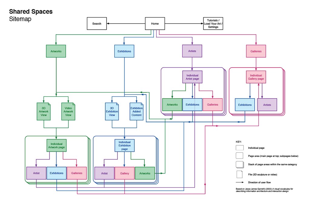
Sitemap
A sitemap provides a “visual representation of the site’s organization and how different sections are linked together” (Babich), like a series of nested folders on a desktop. It is a useful tool for visualizing and refining a site's structural design, or information architecture. Visually representing a sitemap allows designers to iterate this structure before it is coded into the site or app, allowing for consideration of a user’s available pathways to desired information and how to make these more intuitive or shorter.
For the shARed spaces app, we knew we wanted to support both audience – who want to discover engaging artworks – and artists – who want their work to be seen. And we also wanted to design the app for use by galleries, art collectives, and other groups, as we knew they could serve as hubs that provide training, resources, and support to allow more artists in their communities to share art through the app. We focused our organization of the site’s information on how people could discover and view art at home through AR, as additional content for physical artwork could be triggered directly by scanning the art using the app.

While the first version of our sitemap (shown above in black and white) organized information in a logical way, through reflection on our journey maps and storyboards we came to understand that what makes the shARed spaces app unique and valuable for users is the opportunity to view artwork in AR space. So we revised this architecture, focusing on shortening pathways so users could view AR artworks in three clicks or less. We also wanted to emphasize the opportunity for lateral movement between categories, so that a user could discover artworks in multiple ways and to avoid dead ends in user journeys. The colour added to this second sitemap serves to highlight this opportunity for lateral movement.
Wireframe
Wireframes are “nongraphical schematics of the layout or arrangement of a web page or a software/app interface” (Stickdorn et al. 188). They mock-up how content is arranged on a screen and how users can navigate from one page to the next. Content elements are simplified, generally as empty boxes or placeholder text, allowing wireframes to be prototyped quickly through multiple iterations and keeping the focus on usability and navigation rather than how the screens look. Wireframes connect “the underlying conceptual structure (including available functions or information architecture) to the visual design” (188), providing the necessary guides for both developers to code the app or webpage and for designers to create branding elements and the user interface.
Each member of our User Engagement team developed a wireframe for the persona they had created a journey map and storyboard for, taking into consideration the persona’s expected path of interaction with the service as well as their level of comfort with technology. We collectively refined these over the course of a month, eventually combining them into a unified wireframe, which is serving as the basis for both the coding of our app and the designing of our user interface. Lauren Warrington developed a clickable prototype of our wireframe using the Pop app by Marvel. You are welcome to try it out here. It has some glitches (especially the back button) but provides an overview of how we expect the Shared Spaces app to function and provide AR content.
Along with the clickable wireframe, we have created three user tests with specified goals, to see if the pathways to desired content are intuitive and easy to navigate. You are welcome to take these tests yourself. Each should hopefully take only 1-2 minutes (possibly less). You do not need to turn audio/video recording on when taking a test (as it will prompt you to do); just click through the test until you get to the target screen (at which point the test will stop and send a congratulatory message). When you click one of the links below to take the test, it will ask you to enter your name and email. If you would like to remain anonymous, please enter:
Username – Anonymous
Email – sharedspaces.sk@usask.ca
The user tests are:
View Zachari Logan's artwork Cut Flowers: https://marvelapp.com/start-user-test/38FXcyUeejJoxGnq8O8P
View Ruth Cuthand's exhibition Artist in Focus, which was shown at Remai Modern: https://marvelapp.com/start-user-test/SVtQg9Dum6UuSXUUbHDq
Load the audio for Edward Poitras' artwork Cell: https://marvelapp.com/start-user-test/L4M5M6IyYOzkwxVkJhf6
User interface + Branding

With the wireframe created, our Development team began coding, while our User Engagement team started designing the User Interface (UI) and branding for the shARed spaces app. Led by Lisa Birke, they first looked at similar apps as precedents, identifying graphic and usability elements that work well and could be brought into our app, as well as ones to avoid. As we had done with previous sections, they each then began designing a UI with their persona and their persona’s perceived tastes in mind. They began with mood boards, which are “collages of existing or specially created text, sketches, visualizations, photos, videos, or other media to communicate an intended design direction” (Stickdorn et al. 207). From there they began designing UIs for a couple sample screens from the wireframes, collectively iterating and refining these each week, building both off their own ideas and those of fellow team members. Through this process, we arrived at a simplified aesthetic with white and off-white backgrounds that functions similar to many galleries in how it places the focus on the art (as can be seen in the process example included here; please click on it for a full-size image).

At this point, Alyanna Rabanal joined our Development team (funded through a MITACS Research Training Award) and with Lauren has been finalizing revisions and coding our UI into the shARed spaces app. They also developed our logo and branding. The logo references the South Saskatchewan river, which runs through Saskatoon, reinforcing the importance of our connection to the land. The red and blue accent colours give a nod to anaglyph 3D glasses, forerunners to the augmented reality 3D viewer we are building.
Coding in Unity
Led by Carl Gutwin, Febi Chajadi and Brandon Piller are currently coding our shARed spaces app using the Unity development platform. The app is being built in three stages over the next two years, with a projected launch date of January 2022. In this first stage, our focus is building an AR viewer, with the artworks to be viewed being loaded by our team. At present, the app is able to present 3D sculptures in AR space and green-screen videos, as well as regular videos and photos. We are exploring the current and future potentials for the types of digital art and interactions that can be hosted.

Continuing our user centred design process, we are working with USask students who will be presenting art through the Shared Spaces app for Nuit Blanche Eve (see below) to understand the types of art they want to present, how they would like viewers to be able to interact with the artworks, and how they would like the app to function. Lauren is developing sample artworks based on the desires of our Nuit Blanche Eve artists so Febi and Brandon can test these in the Unity environment. As we’re able to build support for these types of digital art and interactions into the app, we’re communicating this back to our artists so they can incorporate these potentials into their own creative processes.
In the second stage (which will start with revisions following feedback from Nuit Blanche Eve), we will build a database so that individual artists can load their own artwork. Over the second and third stages, we will also be building in chat functionality to facilitate increased communication among audience members as well as with artists, curators, and arts administrators. Finally, we will be creating 3D spaces that will allow users to create and share their own digital exhibitions.
At the suggestion of our Advisory Committee, we are placing an emphasis on tutorials and user support to ensure the Shared Spaces app is user friendly and accessible at a range of skill and comfort levels with technology. We are developing tutorials and user guides in tandem with our app build, though they most likely won’t become available to the public until stage two.
Works cited
Babich, Nick. “Sitemaps & Information Architecture (IA).” Adobe, xd.adobe.com/ideas/process/information-architecture/sitemap-and-information-architecture/. Accessed 24 Jul 2020.
“Journey Map.” Service Design Tools, https://servicedesigntools.org/tools/journey-map. Accessed 24 Jul 2020.
Polaine, Andy, et al. Service Design: From Insight to Implementation. Rosenfeld Media, 2013.
Shostack, G. Lynn. “Designing Services That Deliver.” Harvard Business Review, hbr.org/1984/01/designing-services-that-deliver. Accessed 21 Jul 2020.
Stickdorn, Marc et al. This is Service Design Methods: A Companion to This is Service Design Doing. O’Reilly Media, 2018.