User research
We have employed user-centred methodologies throughout our design process – from conceptualization to development – to ensure shARed spaces first learns from artists and audience across the province their needs and desires and then designs in response. Prior to forming our application to Canada Council for the Arts’ Digital Strategy Fund (DSF), we held design charrettes in Saskatoon and Regina that enabled us to form our initial problem space: the challenges in connection and communication that can occur within the arts in Saskatchewan. Upon receiving funding, we held design workshops in seven communities across the province to understand user needs more deeply. Methods for synthesizing this information, such as Affinity Diagramming, allowed us to understand that participants' main desire from their involvement in the arts is personal connection – whether this is with the art, the artist, or each other – and enabled us to form personas that have ensured our participants have remained centred while designing. To create opportunities for greater connection through art, we proposed the development of a digital service for sharing art through Augmented Reality (AR). Through prototyping and user testing we were able to both confirm this direction and refine this proposal to create design specifications which are now guiding us through Development.
Preliminary design charrettes

Before conceptualizing our project for our DSF application, we held two design charrettes with arts administrators, artists, and UX designers, one each in Saskatoon and Regina, in October 2018. At these charrettes we asked participants to discuss some of the opportunities and challenges they saw in the arts and then, in co-creative sessions, to begin brainstorming possible solutions.
These sessions helped us to form the initial problem space for shARed spaces: the challenges in connection and communication that can occur within the arts in Saskatchewan due to the vast and often isolating distances of our province. While we had a broad understanding of this problem space, we did not know the methods that would best be used to address these challenges, and we also recognized that we were missing consultation with key groups - artists and audience members, as well as Indigenous peoples. For this reason, when we wrote our DFS application, we built in our first phase as six months of research, allowing us to consult and collaborate with artists and audience members throughout the province, including First Nations.
Initial community consultations

Upon our DSF application being approved, we held design workshops in seven communities across Saskatchewan, each organized in partnership with arts organizations or artists in each community:
- Estevan (Estevan Art Gallery & Museum)
- La Ronge (La Ronge Arts Council)
- Little Pine First Nation (Janelle Pewapsconias)
- North Battleford (Chapel Gallery)
- Regina (MacKenzie Art Gallery)
- Saskatoon (Remai Modern)
- Yorkton (The Godfrey Dean Art Gallery)
Organizing with members of each community allowed us to build from existing relationships of trust and to reach artists we did not know previously. It has also allowed us to build capacity with these community organizers, enabling them to serve as hubs for this project and leading to greater potential for sustainability and community involvement moving forward.
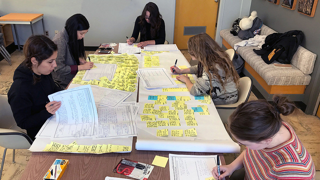
For these workshops, we prepared 11" x 17" worksheets for our participants, asking them to individually fill out each worksheet before discussing their responses as group. This allowed participants to be slower and more individualistic in their responses. It also created space for participants who are more introverted or shy by allowing them to prepare responses on their own before sharing them with the group. Pragmatically, it allowed us to collect more information than we would otherwise have been able to during each two hour workshop.

 The first two worksheets focused not on the digital but rather the experience of viewing art; the first worksheet asked participants to describe an enjoyable art experience, while the second asked them to describe an experience that wasn't enjoyable. The largest section of each worksheet provided space for participants to openly describe their experiences, while shorter prompt questions on the right encouraged them to dive deeper and consider the surrounding circumstances, as these often provide the most insight into why someone uses a service, or what is preventing them from doing so. As an example, a middle-aged father described as his enjoyable art experience a tour he had at a large museum in France. He described how engaging the tour guide was. But, when he started to fill out the prompt questions, the one asking him what other people were present caused him to reflect that he got to share this tour with his teenage daughter and that it was this shared experience that made it so meaningful. This helped us to understand how important connection is in the experience of art.

The third worksheet moved from these broad questions to two more practical ones; we asked participants to describe the three main challenges they are facing and to imagine, in an ideal world, what would be different, or what supports they would have. To move back to our middle-aged father, the tour at the museum in France was a few years ago; his daughter is now in her twenties and has moved to a different city, so he is no longer able to share art experiences with her like he once did. In an ideal world, she would be by his side every time he goes to an art gallery. This helped us start imagining how we could allow people to share art experiences across distance.
Affinity diagramming
We supplemented these design workshops with one-on-one interviews, allowing us to dive deeper into the individual experiences of artists and arts administrators. In total we involved 101 participants, but the knowledge gained through these workshops was largely internalized in the members of our project team who attended these workshops. As well, it was hard to understand which comments spoke to common themes and which were more individualized experiences. To help us understand trends and commonalities among our participants and to share this knowledge with our teams, we employed affinity diagramming, a process used to "externalize and meaningfully cluster observations and insights from research, keeping design teams grounded in data as they design" (Martin and Hanington 12).
Our User Engagement Team started by reading through the worksheets and writing every insight or observation onto a separate, yellow, post-it note. We then grouped these together according to commonality, or affinity. Once a grouping of five or six was formed, we gave this grouping an overarching title to aid in organization, and this title was written on a blue post-it.


The first round of this process was messy, but over three iterations, common trends and themes started to emerge. During these later rounds, we brought in pink post-its to group the blue, and green post-its to organize the pink as the highest level of organization.
Through this process of affinity diagramming, we came to understand some of the main challenges those in the arts in Saskatchewan are facing, some of the methods through which they are addressing these challenges, and what their desired outcomes are.
By far the three largest challenges described – and these were described across the communities we visited – were time, distance, and money.

Participants spoke of the numerous ways they came together to address these challenges, centred around community and connection and collaboration.

And they explained that they came together in these ways to achieve their desired outcome when being involved in the arts – personal connection, whether that connection is with the art, the artist, or each other. (This last point is the one that varies from the exact wording of our affinity diagramming process, as we have refined our understanding of desired outcomes through continued discussion with members of our partner communities.)

Personas
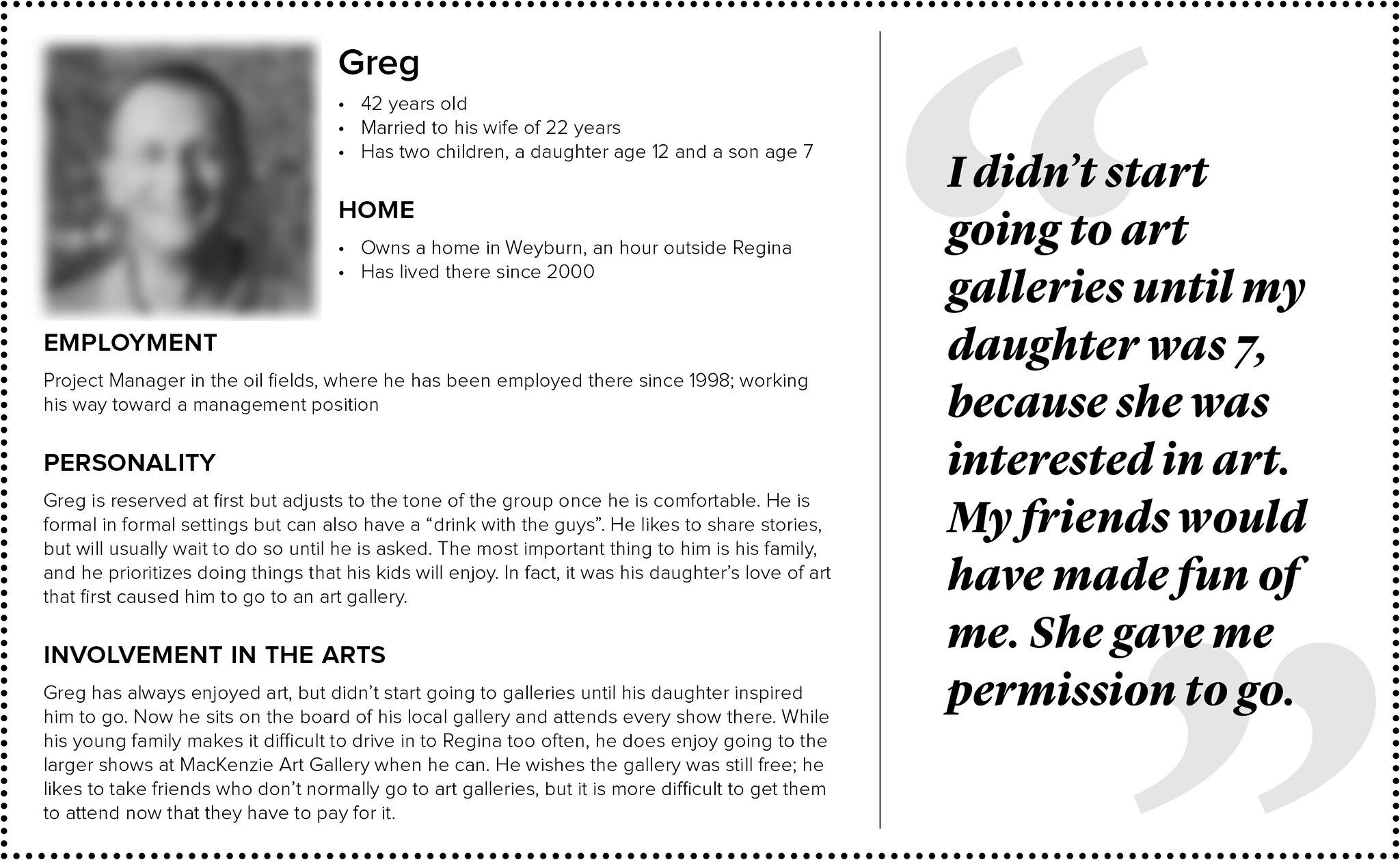
From the understandings gained through this process of affinity diagramming, we developed five personas, which capture "common behaviors in meaningful and relatable profiles" (Martin and Hanington 132). These are another method for externalizing research findings that allow designers to "target a small group of users located in appropriate contexts and to design just for them” (Allanwood and Beare 114), centring participant needs and desires and helping to ensure these are considered and designed for throughout the entire project. We developed our personas as fully as we could to ensure they feel like real people, which makes designing for them more urgent. And we brought in pull quotes that were our best recollections of phrases shared by participants. The five personas we developed are below (please click on each image to view it full-size).


Hackfest

With participant experiences, needs, and desires described through the personas, we began to develop design proposals for our Shared Spaces service. Jon Bath led a weekend hackfest where our User Engagement Team was joined by over a dozen undergraduate and graduate students from Archaeology, Anthropology, Computer Science, Visual Art, and Art History. Working in groups of three they chose specific personas to design for and iteratively created, and presented, various paper prototypes. Each time they presented, they had to start by describing the needs and desires of their persona and how their prototype met these to ensure they were designing for our participants and not for what they individually preferred.
 As the hackfest began, Jon asked our students to first brainstorm physical approaches and then transition these into digital, as this avoids getting stuck on technical details early. One of our groups, who had chosen to design for Stephanie and her desire for more art to come to her community, began by thinking about the Saskatoon Public Library’s old bookmobiles, which used to bring books to neighbourhoods that didn’t have libraries. They spent the first day imagining how a van filled with art could travel the province, setting-up exhibitions in community spaces. At the end of that first day, they came to us as they were unsure how to move off this idea but knew an art van wasn’t the final design solution.
We discussed with them a project Terence Clark undertakes annually with one of his senior level archaeology classes. Each student has to scan an artifact and have the 3D model triggered by a thumbnail image printed on a poster. The hackfest group spent the second day iterating how art exhibitions could be brought to community spaces through printable triggers that presented the artworks from the exhibition through augmented reality. At the end of the hackfest, this idea of bringing art to people through AR resonated most strongly among all the ideas, and we began prototyping the experience so that we could bring it back to our communities for their feedback.
Initial prototyping
We prototyped the experience of an AR exhibition using third-party software, as we wanted to hear from our community partners whether this was a direction they wanted us to pursue before devoting resources toward building our own AR viewer. We chose to use BlippAR for 2D artworks, as it allows for the use of non-QR code images as triggers, but does not display 3D models easily, and Augment for viewing 3D artworks, as it displays 3D models well but requires QR codes to load the images.

We formed a 3D Scanning team who began developing digital 3D models of physical objects using two methods: photogrammetry, a process of stitching together photographs taken at numerous angles around an object, and a stationary 3D scanner. We worked with USask's Museum of Antiquities to scan a number of artifacts. We found the stationary scanner best for creating high definition models, while photogrammetry allowed us to scan and present large sculptures that would not fit in the 3D scanner, such as an untitled sculpture by Bill Epp that sits in the courtyard outside USask’s College of Law (screen shots of the models for a cup from the Museum of Antiquities and Bill Epp's scultpure in AR space are shown below).

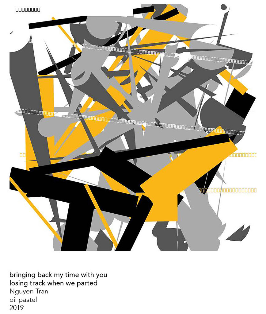
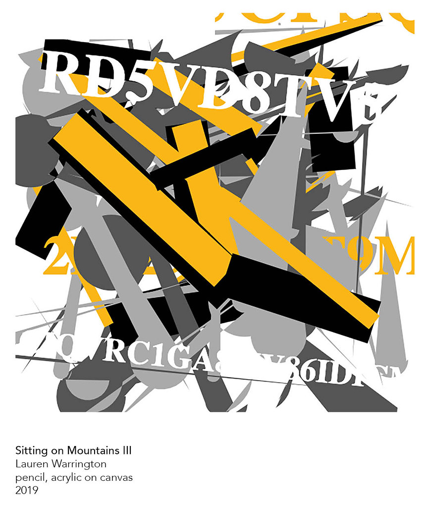
In addition to these 3D models we worked with four recent USask BFA graduates – Kelsey Ford, Nguyen Tran, Lauren Warrington, and Emily Zdunich – to present through AR an exhibition of new work, Body, that they had on display at Gordon Snelgrove Gallery. The works are 2D paintings, drawings, and screen prints, and we linked two works by each artist to printable triggers which could be placed around a community space to simulate the Snelgrove installation.
In previous design workshops participants stated they did not like how QR codes look, so we screen printed a series of abstract images to serve as triggers, with the intention that they could appear aesthetically pleasing on a wall when not being used to trigger AR artworks (two of these triggers are below, and they can be used with BlippAR to view artworks from Body - "bringing back my time with you / losing track when we parted" by Nguyen Tran and "D(r)own II" by Kelsey Ford, respectively; you may need to move your phone quite close to the image, especially the second, to trigger the AR).


However, when we brought these screen printed triggers to our first two workshops, participants expected a connection between the physical image and the AR artwork triggered. This gap in expectation became a barrier to the exhibition experience. As such, we quickly pivoted to using trigger images generated through BlippAR, which look closer to QR codes. The trigger images for the eight artworks from Body are below (you can click each link to view a full size image; the size of the AR artwork triggered changes in relation to the size of the trigger image).
With these new trigger images, discussion moved to the AR artworks and the exhibition experience, rather than the triggers. As through the Affinity Diagramming process we had come to understand participants desire a personal experience connected to the arts, we asked whether they considered this an art experience and whether it satisfied their desire for a personal connection. We expected a number of participants to feel this wasn’t much of an art experience since it was mediated through their phone, but were pleasantly surprised that most of them considered that it was; as one participant explained - they were, after all, still viewing someone’s art.


The feedback from participants at these consultations confirmed that supporting the sharing of art through AR is the right direction for the shARed spaces service. It also provided us insight into what people desire from their AR art experiences. Participants found 3D content by far the most engaging, which helped us to understand that, while the service will support the sharing of numerous forms of art – from sculpture to video to photos or paintings – the 3D viewing experience needs to be primary in our design focus. Participants also described the types of additional content they wanted: personal content, such as interviews with the artists or process videos in their studios, and scientific or other content explaining the foundations on which the work is built.
Canadian Craft Federation's Ten Digit Technology Conference
Before moving fully into our development phase, we had the opportunity to increase awareness and receive feedback about shARed spaces on a national level. Our project team was invited to be part of the Canadian Craft Federation’s Ten Digit Technology Conference, which took place in Saskatoon March 4th to 7th, 2020. Michael Peterson presented for the Building Digital Communities panel, discussing our project’s design process and how this has allowed us to listen to and learn from our contributors across the province, as well as our initial project directions in response (you can watch Michael's presentation on YouTube and hear an audio interview with voicEd Radio's Stephen Hurley). And we presented two AR experiences allowing us to user test both the sharing of a large scale, high fidelity digital 3D sculpture as well as how we could add personal and scientific content to artworks through AR.

We scanned and presented the last canoe made by Mr. Isaiah Roberts and his wife from Stanley Mission, SK. In 1973, the FSIN and the USask Department of Education supported filming to document the traditional manufacture of the canoe, resulting in the film My Last Canoe. The canoe is currently in the possession of USask’s Department of Archaeology and Anthropology and is in the process of being repatriated to Lac La Ronge First Nation. We presented a full-scale 3D model with the actual canoe a few feet away so that conference attendees could compare the two and see the level of detail presented through the sculpture.
 You can view a 1.5' model of the canoe by scanning the QR code below using Augment. (After scanning the code, project the 3D model by aiming your phone camera at a flat surface and tapping the green square that appears on the screen.)
To prototype how the shARed spaces service could bring additional content to physical art, we worked with artist Ruth Cuthand to create AR experiences for two of her works. For "Extirpate this Execrable Race no. 2", which features a magnified view of the small pox virus beaded onto Canadian Forces blankets, Lisa Birke and Lauren Warrington created an animated video interview with Ruth discussing her motivation and intent behind the work and her practice more generally. And for Ruth’s beaded "Hepatitis C", Lauren animated a 3D model of the virus. The trigger images, which we printed onto takeaway cards for the conference, are below. The AR content can be viewed using the Artivive app.

These prototypes were well-received, building the potentials for future partnerships and opportunities to share artworks through the shARed spaces service on a more national scale. User testing with an audience previously unaware of our research and intended outcomes provided the opportunity to better understand how the service may be received – what engages people and what potentially creates barriers to use. This allowed us to further refine our directions and design specifications as we moved fully into development.
Works cited
Allanwood, Gavin and Peter Beare. User Experience Design: Creating Designs Users Really Love. Bloomsbury, 2014.
Martin, Bella and Bruce Hanington. Universal Methods of Design. Rockport Publishers, 2012.